Socialcast
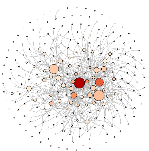
Our division used an enterprise social networking platform called Socialcast from VMWare. One of the nice features is a RESTful API to run data analytics on the users, posts, comments, etc. I wrote some python scripts to mine the Socialcast and LDAP account data, merge and transform the data into csv and GDF formats. I used Gephi to visualize who posted and who is commenting. The resulting network shows each user as a circle with their color indicating the number of comments they made and their size indicating the number of other users who commented on their posts. The lines indicate comments. In Gephi, you can hover to see details of who is who.
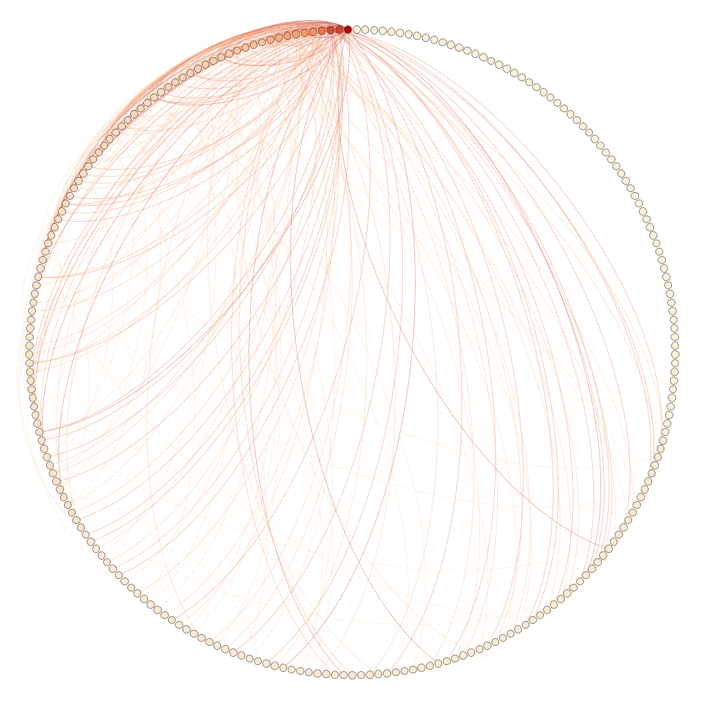
This is a little different visualization using a circular layout:
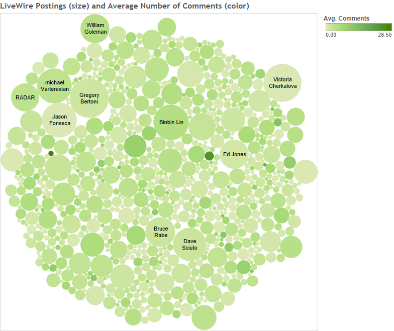
To get a different visualization of who is posting and how many comments they get, I used Tableau and created a bubble chart:
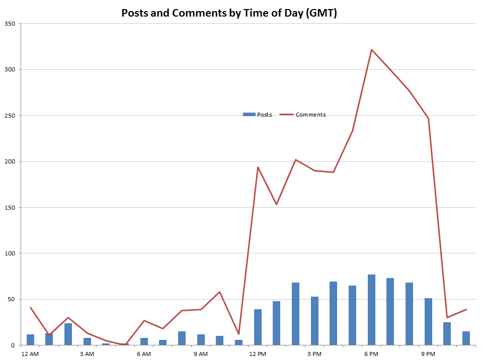
I used Excel to create a pivot table and examine what time of day people were active on Socialcast. Since most of the team was based on the East Coast of the US, 8-5 EST (12-9 GMT) showed the most activity:
We had a few communities of practice (COP) for worldwide team members to learn from each other. I analyzed the posts and comments for four of the COPs over 6 months to visualize any trends. You can see that the GUI COP got steadily more participation while the other COPs were up and down:
